

Journal
In conversation with

Annika Rowson
They say the kitchen is the heart of the home, and in Annika Rowson’s world, it beats with equal parts precision and personality. Her signature? Designing spaces with quiet confidence and purpose, where even the smallest details are beautifully considered.

Bex and Carena from Clique
We caught up with Bex and Carena, founders of Clique, on all things winter rituals (the kind that warm you from the inside out), sisterhood, and how building something meaningful has grown into more than just a brand, but a place where people feel like they belong.

Nadia Lim
From her kitchen to yours, Nadia serves more than just good food. It’s connection. It’s care. It’s a way of life. All shaped by the seasons, grounded in the land, and full of intention. As custodians of Royalburn Station, Nadia and her family live a nourished life, from paddock to plate and everything in between. Whether it’s food or fashion, she knows the real magic (and flavour) starts from the ground up.

Chloe Zara from CZE Hair
If anyone knows a thing or two about hair, it’s Chloe Zara. Founder of CZE Hair, she’s an expert in the kind of good hair days that don’t require a full production. With over 20 years of experience behind the chair, Chloe hasn’t just mastered the art of good hair; she’s bottled it. Now, she’s letting us in on the secret. Trust us, your hair’s going to want to hear this.

Shivana from Four Words
From studying law, to creating content and launching her own styling business, each chapter brought her closer to something truly special. It all began with four little words: ‘will you marry me’. And just like that, a new kind of sparkle was born: Four Words.

Sarah from Sala
It’s not often you step into a space that feels like a warm hug. Then there’s Sala—a multidisciplinary movement studio, the brainchild of London native; Sarah Lindsay. Welcomed with an abundance of energy, Sarah speaks with wisdom and a uniquely refreshing worldview. Being in her presence is uplifting, her positivity contagious, and her energy magnetic. The kind of feeling you can’t help but want to hold onto.

Bex Brent
If you’re anything like us, sometimes it takes Christmas to bring out our crafty side. But then, there are people like Bex who have that magic touch all year round. From founding the iconic Willis York salon in Wellington, New Zealand, to becoming a self-taught ceramicist in the sunny north island, she turns everything she touches into art.

Frankie from The Dirt Company
Life happens, messes happen, and that dribble of coffee nearly always happens. When it comes to laundry, it isn't our first rodeo (or The Dirt Company's either). So when we got the opportunity to talk to Frankie about all things laundry and doing less of it, you bet we asked her the dirty questions.
How to

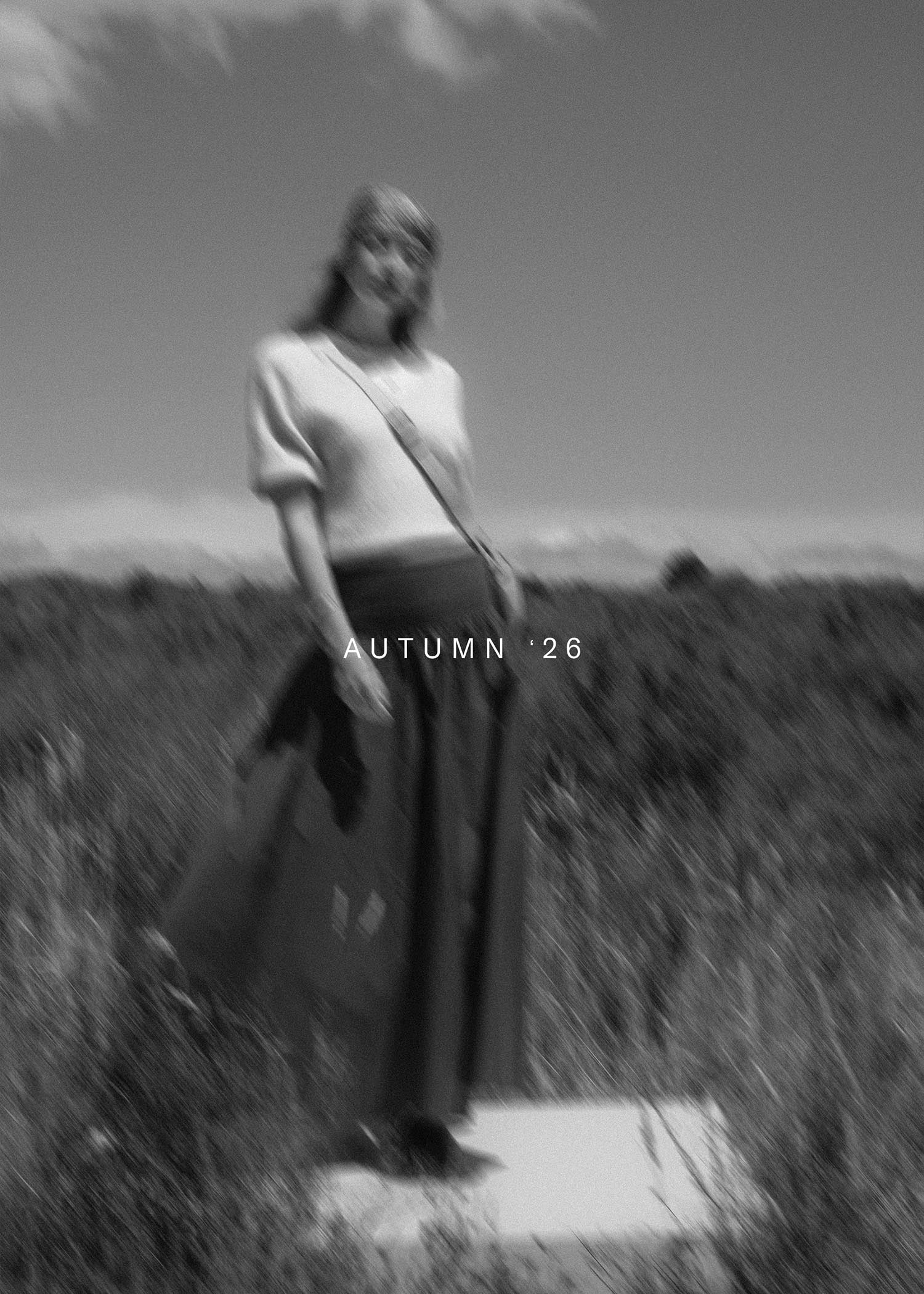
The Art of Layering: Effortless Autumn Style
As the seasons shift and the air turns crisp, layering becomes the foundation of an effortless autumn wardrobe. It’s not just about staying warm, it’s about creating outfits that feel versatile, comfortable, and uniquely yours.
What to Wear (and Gift) This Valentine’s Day
From romantic date night outfits to easy Valentine’s Day gift ideas, discover the Max Valentine’s Edit - plus gift vouchers for when you want to play it safe.
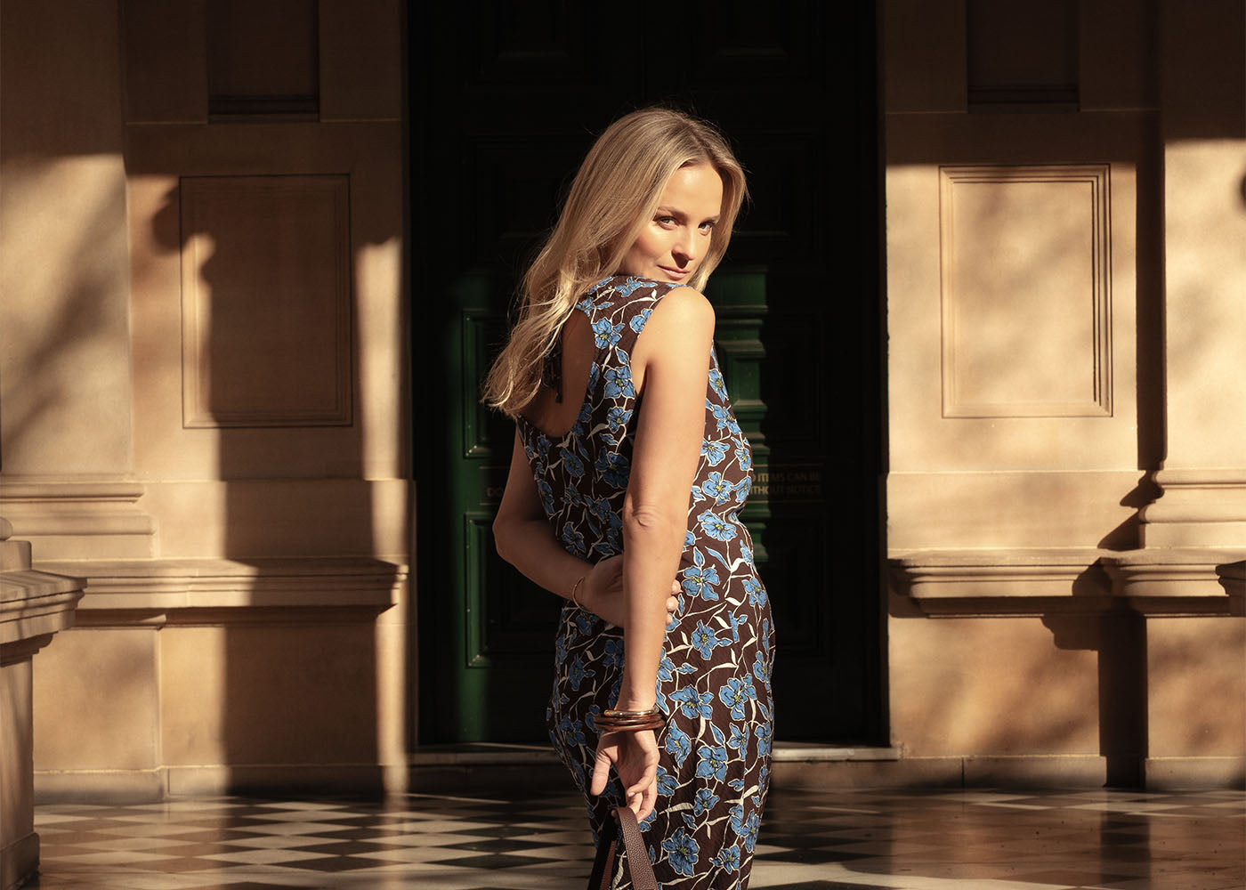
SS25 Dress styling
Remember RSVP’ing just for the excuse to get dressed up? Same. Well, we’ve missed the feeling of getting ready, so we’re bringing it back, one dress at a time. Except this time, it’s not the LBD making a comeback, it’s the bold, the bright, the feel-good kind. Dresses that show up and show off, just like you’re about to.

Make our Frangipane Pear Tart
Deliciously vibrant and just the right amount of cosy, meet our winter warmer: a Frangipane Pear Tart made with love (and pears) by Nadia Lim, just for Max.

Winter Styling
Cold mornings? Your best excuse to get dressed, layered, cosy and warm from the inside out. Enter: your guide for staying cosy and looking cute. Because winter wardrobes should work as hard as you do — from first layer to final coat.

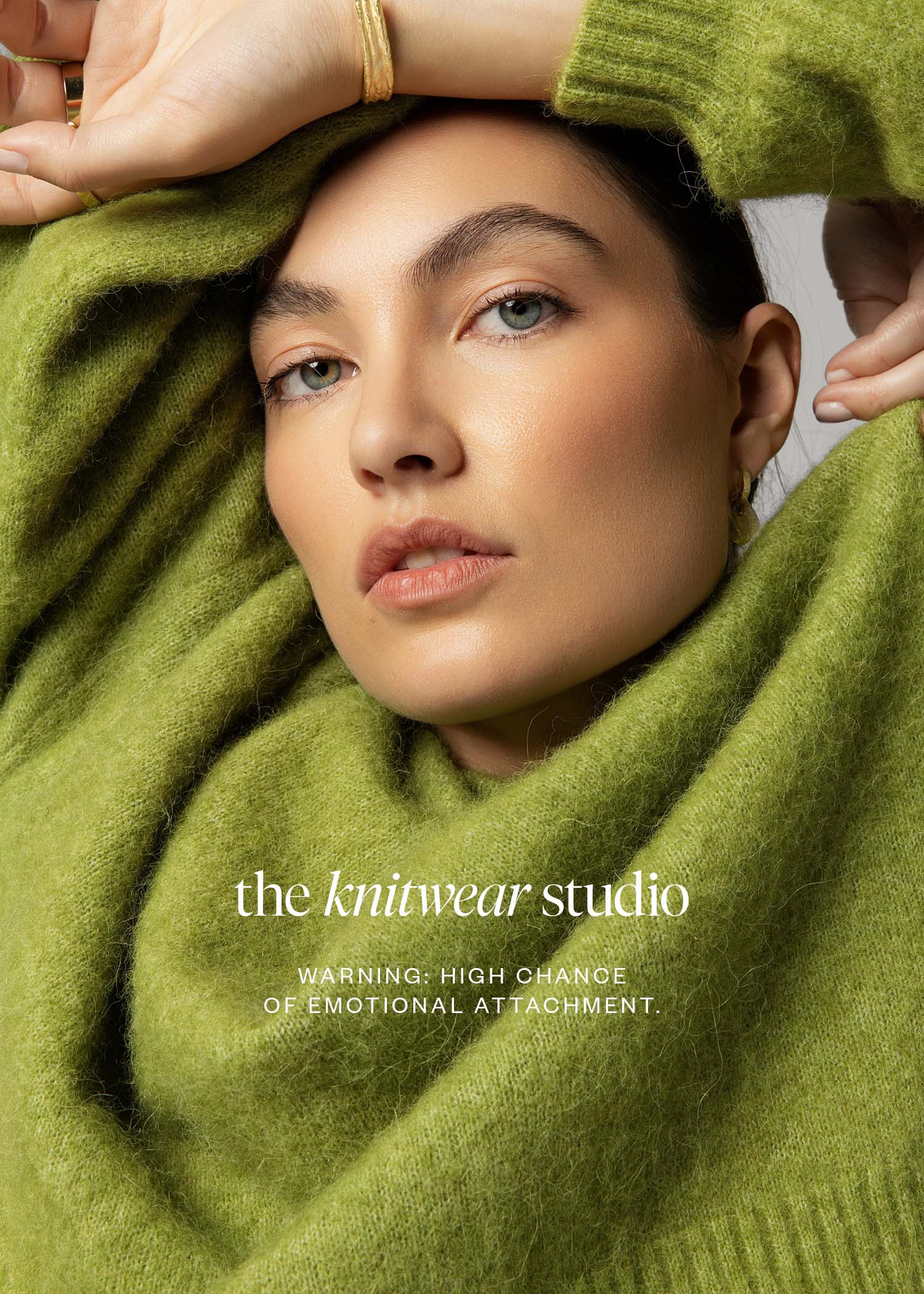
Knitwear Care Guide
We're all about making your fave knits last, and with just a little extra care, your knits will stay looking their best.
Introducing

The Wool Bag
We’ve always had a soft spot for natural fibres and quality knitwear, so welcoming The Wool Bag into our gifting and Artisans collection? Consider that one well and truly in the bag.